The best way to read in the language you're learning
Improvements to the reading interface
July 4, 2023This is a small update, but it addresses a couple of things which have bugged me about Readlang’s reading interface for a while.
Page navigation
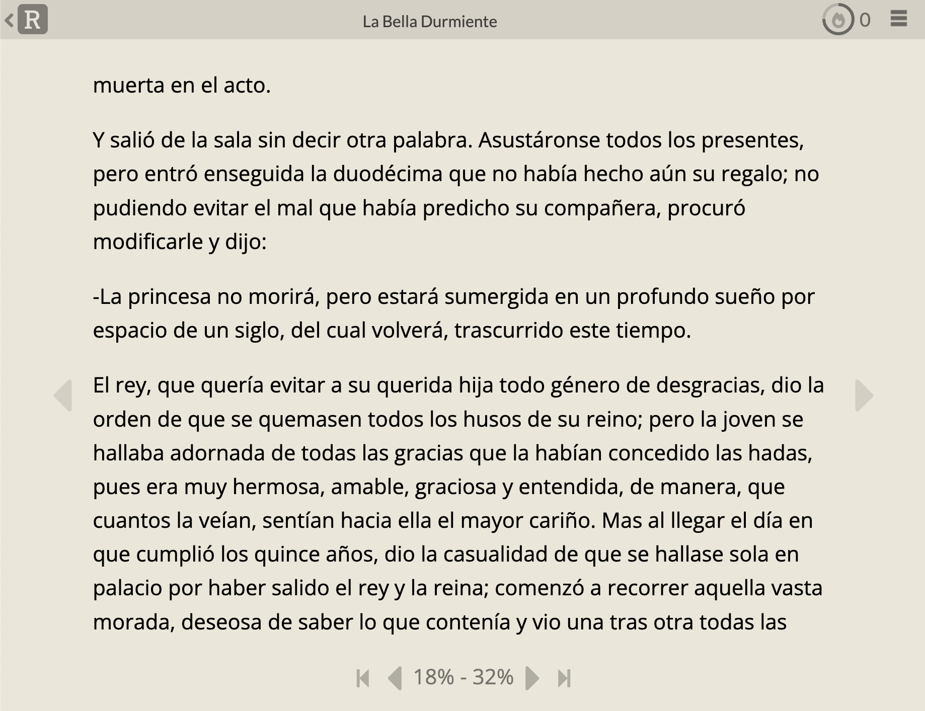
Before, the page navigation UI felt clunky to me:

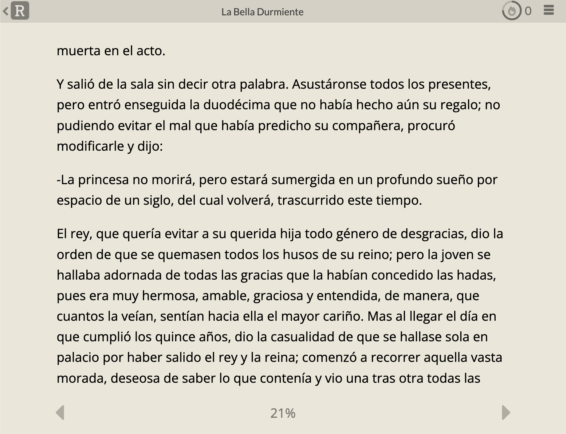
Now, it looks like this:

The difference may seem subtle, but it changes these three things:
- The “jump to furthest read” button used to be right next to the “next page” button. You had to be careful to make sure you were tapping the right one, particularly on mobile. In the new version, the next page button has a larger hit area and is easy to tap without fear of accidentally hitting the “jump to furthest read” button, which is now accessible by tapping on the progress percentage.
- The arrows in the margins were there to indicate that you can tap the side of the page to navigate. Although informative, having so many arrows on the page made it feel cluttered. In the new version you can still tap on the margins to change page but the extra arrows are no longer shown.
- For shorter texts, the percentage is now just a single number instead of a range, which I think looks cleaner. One of the goals of this reading interface is to be distraction free.
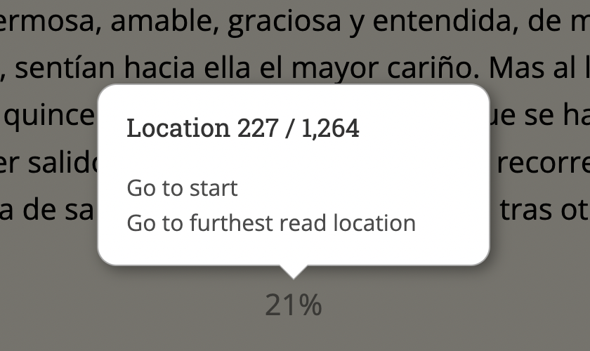
The “go to start” and “go to furthest read” options now accessible by clicking on the percentage at the bottom, which will show the following popup:

Extra context
I’ve finally fixed a long standing bug where the context before the start of the page wasn’t included with your saved words. For example, if you translated the first word in the screenshot above, the context before this fix would only contain “muerta en el acto.”, discarding the first part of the sentence. Since the recent fix, it will now include the full sentence “La princesa se herirá con un huso al cumplir los quince años y quedará muerta en el acto.” Sorry this fix took so long!
Sub-headings now appear in the title bar
Previously, for long texts containing main headings and sub-headings (e.g. for parts and chapters), only the main headings would be selected in the title-bar dropdown, meaning that you couldn’t easily tell which sub-section you were currently reading. Now sub-headings will be selected too.

That’s it for now
These are small changes, but I hope they make your experience with Readlang more enjoyable! Let me know in the comments if you have any feedback!
Tweet comments powered by Disqus